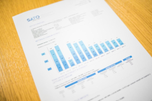
A segmented bar graph is a graphical representation of data in which the bars are divided into segments. The segments can be different colors, sizes, or shapes to make the data easier to understand. Segmented bar graphs are often used to compare data between other groups. A segmented bar chart can show overlap in respondents, act as a relative frequency table, or represent categorical data. So, here’s what you need to know about bar charts and their applications.
How do you make a segmented bar graph?

A segmented bar graph is a graph that is divided into segments, or groups, of data. This type of graph is beneficial for displaying comparisons between groups of data. To create a segmented bar graph, you will need first to gather data that can be divided into groups. Once you have your data, you will need to create a table to organize it. Next, you will need to create a graph that reflects the data in your table. Finally, you will need to label the axes of your chart and add the appropriate legends.
Segmented bar graphs are used to compare and contrast data within different categories. The data is displayed as a single line in a standard bar graph. However, in a segmented bar graph, the information is broken down into different segments, which allows for a more detailed analysis. This type of graph is most useful when there are a lot of data points to compare, as it can be challenging to see the differences between them when they are all displayed on a single line.
What are the benefits of using a segmented bar graph?
A segmented bar graph is a type of chart that is used to display data in a visually appealing way. It comprises individual bars, each of which represents a different category or subset of data. This type of graph is often used to compare data between other groups or track changes over time.
There are several benefits to using a segmented bar graph. First, it is a very visual way to display data. This can be especially helpful when comparing data between different groups or tracking changes over time. Second, it is easy to understand. The other bars make it easy to see how much data is being represented and how it changes. Third, it is versatile. You can use it to display data in various ways, depending on what you want to highlight. Finally, it is easy to create. You can create a segmented bar graph across multiple software programs, making it a convenient option for displaying data analytics.
A segmented bar graph is an invaluable business tool.

Graphs are an essential part of a business because they can help illustrate trends and patterns. For example, if a company wants to track its sales over time, it can create a graph showing each month’s sales data. This can help the company see any trend in the data, such as whether sales are increasing or decreasing. Additionally, you can use graphs to compare data between different groups. For instance, a company might want to know if there is a difference in the average sales amount for customers in other states.
Vertical bar graphs are most commonly used to track and present data measured in terms of quantity. This includes total sales, total profits, and total expenses alongside digital transformation initiatives or other data set compilations. Horizontal bar graphs are most commonly used to track and present data measured in terms of percentage. This includes market share, customer satisfaction, and employee satisfaction.
Stacked bar graphs are most commonly used to track and present data measured in terms of quantity and percentage. This includes revenue by product line, profits by region, and expenses by category. Clustered bar graphs are most commonly used to track and present data measured in terms of quantity and time. This includes sales by day, profits by month, and expenses by year. With so many diverse applications, the segmented bar graph has a significant place in data visualization. From a distribution of salaries to a standard data table, charts alongside automation tools can empower growth and insights.


